
Lee III vs Walmart

When imagining the structure of a big box store, I think of tall ceilings, lots of metal going in multiple directions on the ceiling, and a handful of columns (for the price check machines). As I was wandering around Walmart for this assignment I was surprised by how many columns are in the space. I imagined one every few aisles but this Walmart had a few in every aisle. They do a good job of trying to make the columns blend in, in a very obvious way.

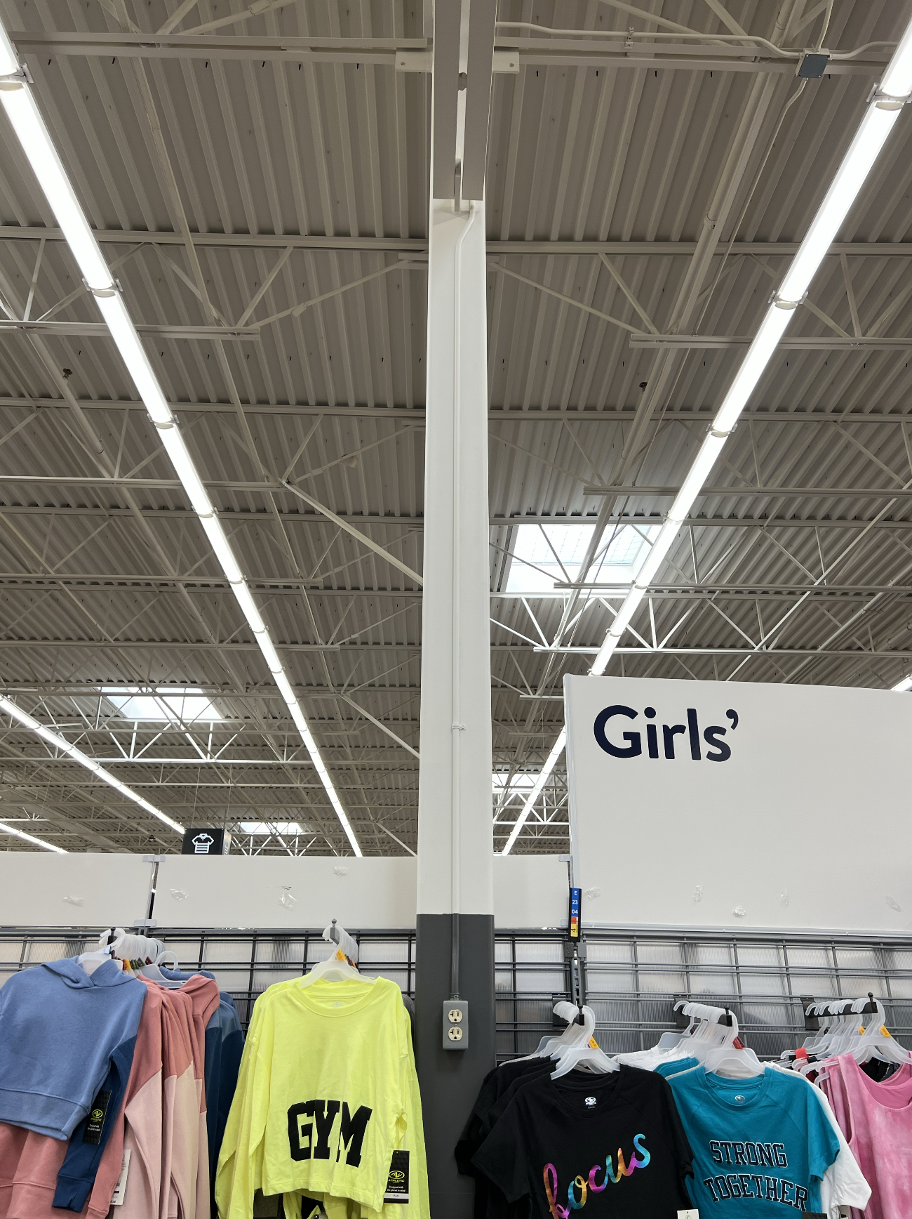

I think I also get so used to mundane structural elements like that so even if they are every ten feet my brain does not recognize it as an element to pay attention to. Walmart also does a great job of making the space feel massive with the track lights running from the entrance all the way to the back of the store. All of the other structure elements are above the track lights so they are relatively out of sight.
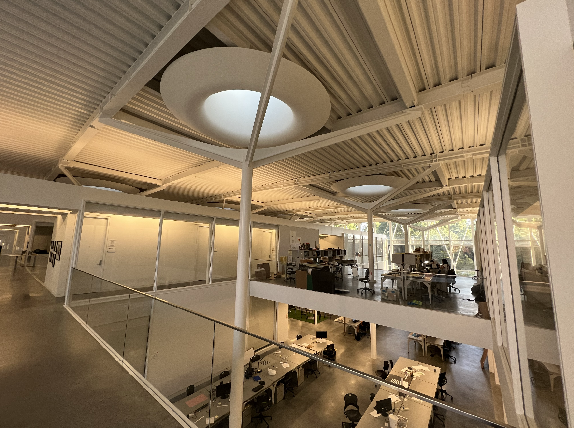
Whereas in Lee III, the columns are highlighted by making them the center of attention, directly under the huge skylights and also, physically in the center of the space. Even though Walmart has skylights, they are overshadowed (or over-lit) by the bright artificial lights dropped below them. In Lee III, there are no visible artificial lights in the space, giving emphasis to the skylights. Also, the way the column stopped below and spreads out to the four corners around the skylight frames the circular natural light in an alternative way.

There are smaller, square columns that are hidden, pushed almost against the walls in hallways or corridors. These columns are more reminiscent of the columns of Walmart as they look like they are trying not to bring attention to themselves.


While Lee III does not have track lights running from the front of the building to the back to make the space feel massive horizontally, the emphasis of the columns do make the space feel massive vertically. The visual action of the columns breaking through the second floor, to spread out and attach to the ceiling like an upside down rocket landing on the moon, gives this grand auroa to the space. The way the offices are set up in rows defineltly divides the space since I cannot see over the two story tall rows, unlike walmart where I can almost see over the aisles (if I am standing far enough away).
If I had to choose a preferred method of dealing with the structural membrane of the space, I prefer the Lee III way. If the columns have to be there, make them THERE. Consciously make them included in the space instead of this weird afterthought that makes columns look embarrassed of themselves. If we compare these two spaces in visual density, we see that Walmart is less dense since they allowed for more space above the aisles for the space to breathe. With Lee III having two-story offices, that causes more visual density (obviously because you cannot see through it).